

Most visitors do not read a homepage from top to bottom.
They scan the first section and decide whether the business feels relevant, credible and easy to understand.
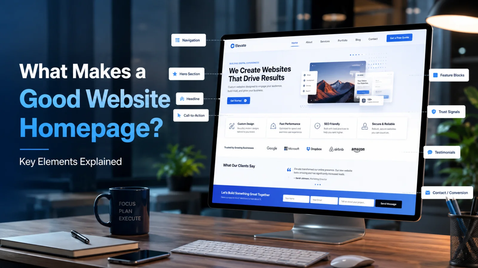
That means the homepage must answer three questions quickly: What does this business do? Who is it for? What should I do next?
A homepage does not need to explain everything. It needs to orient the visitor, establish trust and guide the next decision.
The essential homepage elements
| Element | What it needs to achieve |
|---|---|
| Clear headline | Explain what the business offers and who it helps |
| Primary CTA | Make the most important next action obvious |
| Social proof | Reduce doubt with reviews, testimonials, results or recognised clients |
| Simple navigation | Help visitors reach important information quickly |
| Customer-focused copy | Communicate outcomes and problems instead of talking only about the company |
| Fast performance | Make sure the message appears before slow loading causes visitors to leave |
Start with a clear headline
“Welcome to our website” uses the most valuable space on the page without communicating anything useful.
A stronger headline would be:
“Conversion-Focused Websites for Growing Service Businesses.”
The second version immediately helps the visitor decide whether the website is relevant.
Clarity is more valuable than cleverness during the first few seconds of a homepage visit.
Choose one primary call to action
A homepage may contain several useful actions, but one should be visually dominant.
Depending on the business, that could be:
Book a consultation
Request a quote
Shop products
Start a free trial
Schedule a demo
When every button has equal visual priority, the visitor has to decide what the website should have already made clear.
Place trust signals early
Testimonials and client logos should not automatically be pushed to the bottom of the page.
Useful proof near the first major decision point can include client logos, review ratings, case-study results, certifications, years of experience or customer numbers.
Trust should appear before the visitor reaches the moment where they are expected to act.
Keep navigation simple
Most important pages should be reachable within one or two clicks.
Typical core navigation may include Services, Products, Work, About and Contact.
Complex menus make customers work harder to understand the business.
Write from the customer's perspective
Many homepages begin with several paragraphs about how passionate the company is.
Customers are usually more interested in what the business can help them achieve.
Lead with the problem, desired outcome, value and evidence. Company background can support that message later.
Protect page speed
A visually impressive homepage can still underperform when it loads slowly.
Large videos, sliders, excessive animations and unnecessary scripts can delay the most important information.
Performance should be treated as part of design rather than a technical detail addressed after launch.
A practical homepage checklist
Frequently asked questions
How long should a homepage be?
There is no fixed ideal length. It should be long enough to explain the value, build trust and address important objections without adding repetitive sections.
Does every homepage need a video?
No. Video is useful when it demonstrates a product or explains something more effectively than text, but it should not be added simply because it feels modern.
Should pricing appear on the homepage?
That depends on the sales model, but providing some indication of pricing or process can reduce uncertainty where cost is a major customer concern.
Monk Media One designs business websites around clear messaging, mobile usability, performance and conversion goals rather than treating the homepage as a decorative introduction.
Make the first screen of your website do more work.
Build a homepage that communicates clearly, establishes trust and guides visitors toward conversion.
Explore Website Development